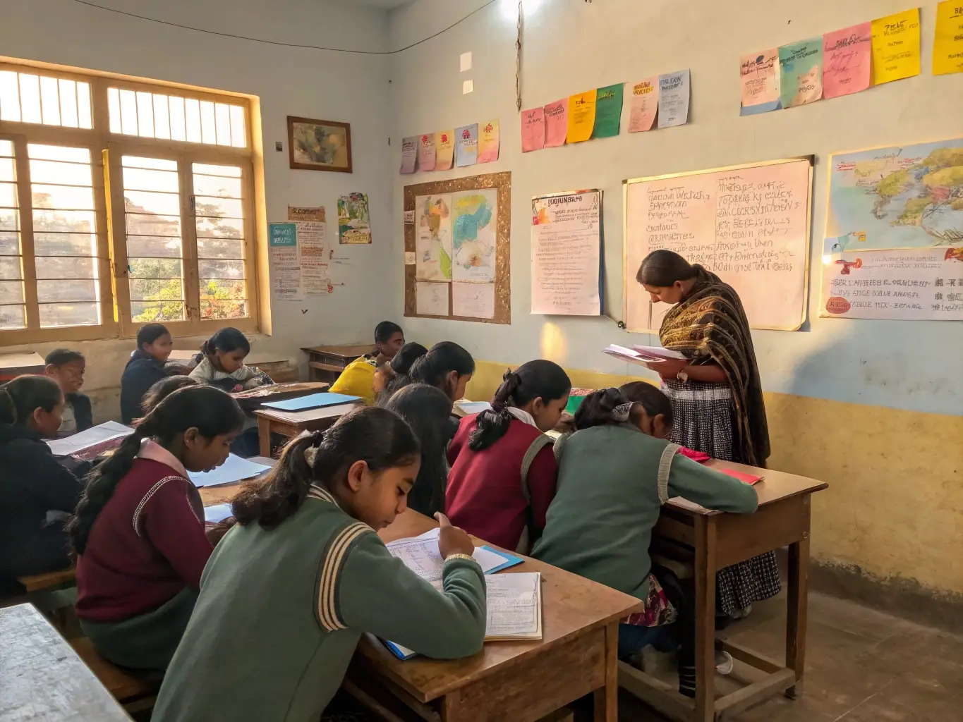
Fresh practice questions for Class 7 Maths Chapter 13 “Connecting the Dots”, reinforcing mean, median, dot plots, and bar graphs. These Class 7 Mathematics Chapter 13 important questions are handy for last-minute exam practice.
Last Updated: September 23, 2026
Q1. Find the mean and median of the data set: 12, 15, 9, 21, 15, 18, 9, 15.
Answer: Sum = 12+15+9+21+15+18+9+15 = 114. Mean = 114 ÷ 8 = 14.25.
Sorted: 9, 9, 12, 15, 15, 15, 18, 21. Median = average of 4th and 5th terms = (15 + 15) ÷ 2 = 15. Mean = 14.25.
Q2. Assertion-Reason — Assertion (A): The mean of a data set can never be less than its minimum value or…
Assertion (A): The mean of a data set can never be less than its minimum value or greater than its maximum value.
Reason (R): The mean is calculated using only the values already present in the data set, so it must fall within their range.
Answer: Both A and R are true, and R correctly explains A.
Q3. A data set has 12 values. Which value(s) do you need to find the median?
Answer: Since 12 is even, you sort the data and take the average of the 6th and 7th terms (the two middle values) to find the median.
Q4. Spot the Error — A student calculated "how many times more" one bar's value (60) is compared to another…
A student calculated “how many times more” one bar’s value (60) is compared to another (15) by writing: “60 + 15 = 75, so it is 75 times more.” Identify and correct the error.
Answer: Incorrect. To find “how many times more” one value is compared to another, you must divide, not add: 60 ÷ 15 = 4 times.
Q5. The weights (kg) of 5 students are 32, 35, 30, 34, 34. If a 6th student weighing 45 kg joins the group, how does the mean change?
Answer: Original sum = 32+35+30+34+34 = 165. Original mean = 165 ÷ 5 = 33 kg.
New sum = 165 + 45 = 210. New mean = 210 ÷ 6 = 35 kg.
The mean increases from 33 kg to 35 kg, because the new student’s weight (45 kg) is well above the original mean, pulling the average up.
Q6. HOTS — A cricket player's runs in 5 innings are 45, 60, 20, 90, 35. In the 6th innings, how…
A cricket player’s runs in 5 innings are 45, 60, 20, 90, 35. In the 6th innings, how many runs must they score to raise their mean to exactly 50?
Answer: For a mean of 50 over 6 innings, total runs needed = 50 × 6 = 300.
Current total (5 innings) = 45+60+20+90+35 = 250.
Runs needed in the 6th innings = 300 − 250 = 50 runs.
Q7. Explain, with an example, why the median is sometimes a better representative value than the mean.
Answer: The median is less affected by extreme values (outliers) than the mean. For example, for the data 2, 3, 4, 5, 50, the mean is (2+3+4+5+50) ÷ 5 = 12.8, which is far higher than almost every value, while the median (the middle value, 4) better represents the “typical” value in the data set.
Q8. What is a dot plot, and when is it more useful than a bar graph?
Answer: A dot plot represents each individual data value as a dot placed above its position on a number line. It’s especially useful for smaller data sets because it shows every individual value (and repeated values, as stacked dots), letting you see the spread, clusters, and outliers directly — something a bar graph (which usually groups or totals data) doesn’t show as clearly.
Q9. Two vendors' daily sales (in units) over a week are: Vendor A: 20, 22, 21, 19, 23, 20, 25; Vendor B: 15, 30, 10, 35, 12, 28, 20. Both have the same mean (21.43, rounded). Which vendor's sales are more consistent, and how can you tell without just looking at the mean?
Answer: Vendor A’s sales are more consistent. Even though both vendors may have similar means, Vendor A’s values (19 to 25) are clustered tightly together, while Vendor B’s values (10 to 35) are spread out widely. Plotting both data sets as dot plots would show Vendor A’s dots bunched closely and Vendor B’s dots scattered — the mean alone doesn’t reveal this difference in spread.
Q10. A double-bar graph compares the number of books read by boys and girls in a class over 4 months. What key features should such a graph always include to be read correctly?
Answer: A double-bar graph must include: a clear title, labelled axes (categories on one axis, values on the other), a stated scale (what one unit of bar length represents), two differently coloured/patterned bars per category (one for each group being compared), and a legend/key identifying which colour represents which group.
See also: NCERT Solutions for Class 7 Maths Chapter 13
Quick revision: Revision Notes for Class 7 Maths Chapter 13
- Chapter 1: Large Numbers Around Us - HOTS
- Chapter 2: Arithmetic Expressions - HOTS
- Chapter 3: A Peek Beyond the Point - HOTS
- Chapter 4: Expressions Using Letter-Numbers - HOTS
- Chapter 5: Parallel and Intersecting Lines - HOTS
- Chapter 6: Number Play - HOTS
- Chapter 7: A Tale of Three Intersecting Lines - HOTS
- Chapter 8: Working with Fractions - HOTS
- Chapter 9: Geometric Twins - HOTS
- Chapter 10: Operations with Integers - HOTS
- Chapter 11: Finding Common Ground - HOTS
- Chapter 12: Another Peek Beyond the Point - HOTS
- Chapter 14: Constructions and Tilings
- Chapter 15: Finding the Unknown
Frequently Asked Questions
How would you plot the point with coordinates (3, 4) on a graph?
Starting from the origin, you move 3 units along the horizontal x-axis and then 4 units up parallel to the vertical y-axis, marking the point where these two movements end as the location of (3, 4).
Why is the order of the two numbers in a coordinate pair important?
The first number represents the horizontal x-position and the second represents the vertical y-position, so swapping their order would locate an entirely different point on the graph.
Chapter Quiz — Test Your Understanding
Class 7 Mathematics Chapter 13 – Solutions and Notes
For complete step-by-step answers and a quick summary, check the Class 7 Mathematics Chapter 13 Solutions and Class 7 Mathematics Chapter 13 Revision Notes.
Recommended: Buy the Printed NCERT Class 7 Maths Book (Part 2)
Contains Amazon affiliate links.
If you’d like a printed copy alongside the PDF, here’s a verified option:
4.6 out of 5 stars (3 ratings) · Rs. 130
Price and availability may change on Amazon. As an Amazon Associate, ncertbooks.org earns from qualifying purchases.